Achieving Less Than One Percent Bounce Rate For A B2B Website: How To Bell The Cat?
on Mar 14, 2013
Year 2010-2011: Our company website was not providing a satisfactory level of leads and traffic.
November 2011: We decided to revamp it and in the process made a website that not only started generating a lot of leads [a conversion rate of 3%] but that very website enjoys LESS THAN ONE PERCENT BOUNCE RATE today.

Website Bounce Rate - By Medium
So, here’s what went into the making of a B2B website that boasts of having “less than one percent bounce rate”.

Website Bounce Rate
Design
Our earlier company website was loaded with a hoard of heavy .gif images that were actually not required. We replaced them with relevant static images that reduced the loading time of the website drastically. We did away with the colorful look and revamped the design using more corporate colors like black, grey and blue. We removed all the excessive clutter and made way for a neat and clean layout.


OMLogic Old Look OMLogic New Look
Then came the banners. The earlier banners on the homepage were centered around a problem and a solution. We decided to use the new banners to showcase our outstanding work done for our clients. We created these banners such that each of them may reflect a case study on its own while projecting a specific result achieved for a client. The idea was to showcase our achievement in as diverse segments as possible, with an interesting mix of images and content.
Right below the banner we placed our three major services, namely – “Brand Management”, “Social Media Marketing” and “Application Development” to offer the maximum information in the first fold. The idea was to make everything available to a visitor without making him scroll down.
Just below this band, came the link to customer portfolio and the latest post on the official blog. The redesigning of the website was not just limited to changing the colors at random but was backed with strategic placement of various elements such that the customers may not have to hunt for anything.
Content (WIIFY)
Most of the people who come searching for ‘Online Marketing’ know that it is something that can help them, ‘how’ is what they don’t know. While writing the content for our website, we focused on telling the user what online marketing is and how it can help them and their business. We were clear about the services we were offering and how they could help the customers who came searching for them. This helped us empathize with them and thus write about the services efficiently.
What lent the content true strength was that each piece of the website content was written by an expert. So, it was not about a random writer writing about PPC or SEO, sitting in isolation, but an expert who had lived in the field for years. Also, while writing about a particular service under a segment - like while writing for ‘Channel Management’ under ‘Brand Management’, we ensured that ‘Channel Management’ may always relate to ‘Brand Management’ at a broader level so that the reader knows that it (Channel Management) is very much a part of Brand Management.
Gaining from our previous experiences, we singled out customer pain areas and derived the right messaging with enough ‘Calls to Action’ at all the required points. We thought about and wrote the content for the website thinking ‘What’s in it for me’ from the customer’s perspective, and it worked.
Navigation
We were clear that we wanted single point navigation. So, it was not about making menus for the heck of filling up the right, left, top or bottom bars, but it was about making the user experience simple and one touch. We used the same menu throughout the internal pages so that the user may get used to it. So, the navigation that they followed on the homepage remained the same even when they had moved to the internal pages.

OMLogic Old Menu Bar

OMLogic New Menu Bar
We analyzed that every company (including us) was always interested in showcasing what they had on offer. We decided to go the other way round. Instead of identifying services as something we wanted to offer, we drilled down to identify the services that the customers are usually looking for. We thought about our navigation options as a customer would do and then provided them the range of services that could help them achieve what they wanted. So, if a customer came searching for ‘lead generation’, we wanted to let him know that they had ‘SEO, Localization, Paid ad campaigns, Search ads, and CPL campaigns’ etc. to choose from.
After we had done all this and the new website was up and live, making our hearts swell over the “less than one percent bounce rate” statistic, there came another statistic. While the website was enjoying an unimaginable bounce rate, the bounce rate of the official blog was close to 16 percent. And, then it was time to revamp it, as well.

OML Blog Bounce Rate
So, on one hand we motivated everybody in the team to write for the official blog, on the other hand we changed the whole look of the blog. While the previous blog layout showed one post at a time and some other popular entries, we switched to a template that showed multiple blog entries in the first fold. We tweaked the categories, and changed the placement of various elements with the aim to increase engagement. The idea was to show multiple blog entries at one place assuming that if a person likes one blog post, there may be several others visible to him alongside that he may want to read. And, it worked! Today, the blog too has “less than one percent bounce rate”.
And, are we proud of it? You betcha!
If you have any questions, insights or observations on this strategy, I’d love to hear your thoughts either in the comments or on Twitter @OMLogic.
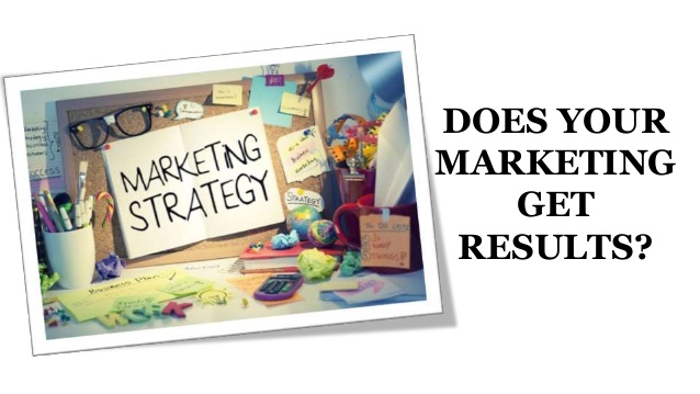
Recent Post
.png)
.png)

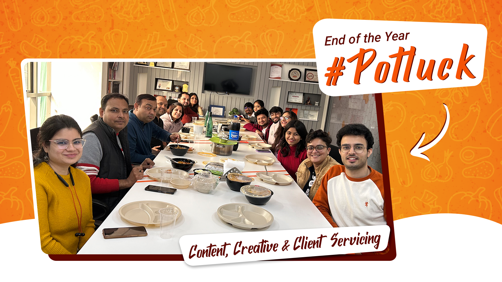

More Stories


Copyright © 2026 - OMLogic Blog. All rights reserved.